
An Author’s Guide to Cover Design

It’s not uncommon for a team to be involved in briefing a designer — they may not be acting as a team, but there’s often one involved. A sales manager who has her eye on that cover that’s on display in Book Bonanza’s shop window; the marketing manager who keeps up with the new trends and the language around covers, “It needs some spacy calmness for the furniture to show up the title text.” Perhaps the bookseller, “Put a snake on it in a herby sort of border.” The managing director “We don’t do serifs or colour at Gubbins & Potsdamer.” Then there’s the production manager, the print buyer, the design manager. Everyone has something to add to the sauce, not least an expectation of stellar sales. Then someone rings the author. “He says blue reminds him of his dead mother and the goat is the wrong breed?”
Which all goes to say that cover design has its contexts. The person that truly matters is, of course, the reader — yet a cover has many important audiences before we reach that goal. It is the chief means by which people make their investments in the book in the supply chain long before the bound paper book block touches the shelves. A cover signals commitment from the publisher, it signals desire among booksellers, it signals prospects among the supply chain and its critics and reviewers. Many will be spending their money before anyone has read a word.
Who Decides?
It’s entirely possible that the author will have no contractual say in the matter, though few would be brave enough to go to press with a cover an author despised. Yet many covers are compromises and copies, and covers, like many parts of our modern lives, are influenced by fashion. A cover that breaks ranks and stands out has as much chance of failure as success and so many covers play it safe. Being bold can also mean being ignored. As one friend put it, The cutting edge is also the bleeding edge. Some markets have their own design universes, like crime, or romance — and it will take a brave soul to depart from the conventions of the genre.
Yet we all aspire to good cover design, and we all recognise that in the fiercely competitive environment of today’s global book trade, a cover can really help make a book work, by which we mean, distinguish itself.
Whomever compiles the brief has no easy task, they will be serving the multiple masters listed above and trying to find a way forward to inspire a designer to deliver a pot of gold in the shape of a small rectangle.
Putting a Brief Together
Do provide a synopsis, but not necessarily the entire book. List three powerful visual moments. List one or two key visual themes. If the book had a palette, of which colours would it be comprised? How would you like readers to react to it?
Do not ask for your entire book to be illustrated on the cover. “There must be a gold sky with twenty-six ravens, and a golf house, a small bus, traffic cones and a trifle, but no jelly. And on the trestle tables, bunting. And a seal. There are two main characters, one tall, the other taller, each has a mole. They are wearing jacquard ties. They must be shown in front of the thirty-seven villagers, all attempting to get into a train. The train is going to Doncaster.”
Detail is the great enemy of good design. Yet so too is needless abstraction. “Can it be wavy green with splashy washy bits. Except blue.” Inspiring a great design can often be found in seeking out the monolithic and iconic message a successful cover often presents, “If she had eyes, they would be stones.” Leave plenty of room for the designer to imagine, to take risks, and above all to surprise you with their own art. Never ask a designer to work up your own ideas. If you have ideas, especially strong ones, express them as visual journeys. Don’t offer destinations.
Perhaps the best way to ask questions is to show things that you believe work for you. Other covers that appeal, especially ones relevant to the text. Create a visual space for the designer to work in, and add your brief to provide context and challenges. Good questions expose the problem, good questions get to the central, even the reductive, theme of the book. “If there was ever a home like this, it would be a songless house on a wet hill with a red rat at its heart.”
Ask for three visuals, perhaps ask for some early sketches, to see where things are leading. Or be bold and say, I am prepared to be surprised.
It’s also important to know the mechanics of a cover — once it’s passed through its committees and is en route to the bookstore, its role really comes into its own.
What Is The Role of a Cover in the Bookshop?
Among the tens of thousands of books being put in front of readers, in stores or online, it’s job is simply to attract the browser, that momentous millisecond of compulsion that makes someone pick the book up, read the blurb and break open the spine. Think of it. You spot something, your eye stops its movement, you lean forward and pick up the book, you turn it over and read an endorsement, your eye flickers, you read down, Ah, it’s about the last water mill in a land of drought. You open the book and a journey begins (one that starts at the till). Think back, the cover merely had to stop you moving on and its work was almost done, such a simple and perplexing thing. Would something more complicated have worked better? Would something less fussy? Would something less drab?
The Process
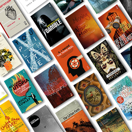
Not everyone can afford a £3,000 cover budget or be willing to have a six month internal circulation list for everyone to argue over within a publishing house. You may be going it alone, you may be self-publishing. The problems are still the same, your cover must be distinctive, distinguishable, memorable, singular and arresting. Stock art can provide a basis, but rarely a solution, to your needs. Typography should be clear and maintain some personality. Avoid a title top, a box for an illustration and your name at the bottom. Avoid the reverse, too. Above all, go into a bookstore and look at covers. Look at a lot of them. What is going on in the world of covers? What are the expectations? Know your market and address it. Understand who the readers are. Free fonts can help in devising sketches. Test your ideas out with professionals. Don’t test them out with friends. Look at your cover in the context of your competitors. Above all give it time. If you’ve spent years writing your book, at least give a few months to considering the cover. Be aware of your own prejudices. Be aware of your own tastes. Pay attention to space and position, to colour and clarity. If your book is to be printed, above all, remember the spine, for this is what most readers will see. Don’t mistake a poverty of design as the representation of authenticity. Don’t over elaborate, either. Look at your cover from twelve feet away; can you recognise it, read it?
Going for Glamour
Let’s roll back through these notes towards a design. If we are using a designer, we want to enthuse and inspire, we want to ignite not instruct. We want to understand the context in relation to other covers. We want to be aware of those who will put our book in front of readers. We want the readers to pick it up or click on it. Whether we use a designer or produce something ourselves, we are all chasing something singular, clear and memorable. We are avoiding complexity. We are signifying the book more than illustrating its contents. Above all we are branding it. Remember that brands symbolise and represent complicated relationships and stories by simple means. Simple doesn’t mean dull. in fact, perhaps the best mantra is, don’t be dull. The world needs its little moments of glamour.
Enjoy the post? Please Like what we do on Facebook:
Discover the 10 Books that Made Salt.

Chris Emery is a poet and director of Salt. He has published three collections of poetry, a writer’s guide, an anthology of art and poems, and edited editions of Emily Brontë, Keats and Rossetti. His work has been widely published in magazines and anthologised, most recently in Identity Parade: New British and Irish Poets (Bloodaxe). He is a contributor to The Cambridge Companion to Creative Writing, edited by David Morley and Philip Neilsen. He lives in Cromer, North Norfolk, with his wife and children.